sarah's key by tatiana de rosnay
/ My cousin Diane recommended and lent me this book. I practically read it all in one sitting. Very moving... the kind of book that sticks with you. I knew nothing about this disturbing piece of Parisian history.
An American journalist researches the notorious roundup of Parisian Jews and uncovers her French family's war-era secrets.
By Tatiana de Rosnay - St. Martin's Press (2008) - Paperback - 320 pages - ISBN 0312370849
A New York Times bestseller. Paris, July 1942: Sarah, a ten year-old girl, is brutally arrested with her family by the French police in the Vel’ d’Hiv’ roundup, but not before she locks her younger brother in a cupboard in the family's apartment, thinking that she will be back within a few hours.Paris, May 2002: On Vel’ d’Hiv’s 60th anniversary, journalist Julia Jarmond is asked to write an article about this black day in France's past. Through her contemporary investigation, she stumbles onto a trail of long-hidden family secrets that connect her to Sarah. Julia finds herself compelled to retrace the girl's ordeal, from that terrible term in the Vel d'Hiv', to the camps, and beyond. As she probes into Sarah's past, she begins to question her own place in France, and to reevaluate her marriage and her life. Tatiana de Rosnay offers us a brilliantly subtle, compelling portrait of France under occupation and reveals the taboos and silence that surround this painful episode. - Google.com
TATIANA DE ROSNAY was born in the suburbs of Paris and is of English, French and Russian descent. She is the author of nine French novels. She also writes for French ELLE, and is a literary critic for Psychologies magazine. Tatiana de Rosnay is married and has two children. SARAH'S KEY is her first novel written in her mother tongue, English.
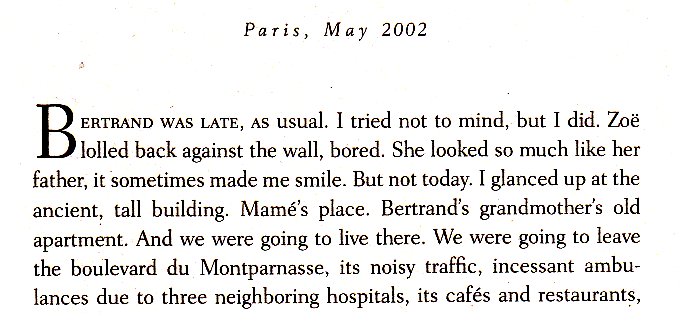
AND here is something really interesting... some good typographical design in this book. The book is told in two voices. The first is the 10 year old Sarah and the second is the journalist Julia. They very interestingly use two serif faces one for each voice.

This is Sarah speaking. This is an older looking typeface that is darker and heavier looking. That is enhanced by the drop cap that is used.

And here is Julie speaking, also a serif face but a lighter, more contemporary one. The drop cap also reflects this.
This is very subtle. As they did use two serif faces, not one serif and one san serif. And I didn't see this until page 44 and then had to immediately go back to make sure that this wasn't just some error in typesetting. And my guess is that many people will read this book and not notice this. But I really like those kind of little things that are part of good design and a well thought out project. They should be subtle and should enhance the over all experience. I read this book as a paperback so I can only assume this is also in the hard cover. But here is the real question... will it be set like this in an electronic book reader? And if not then that is another reason why I just can't make this switch from a real book that can have good to typography to electronic words on a device. For me it just isn't the same.
(Thanks Diane!)
And since this is an older book it is available quite reasonably (used) from Amazon. Link on the right if you are interested.