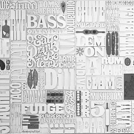
type tuesday... gastrotypographicalassemblage
/
 This piece of typographical art appeals to me the same way as Michael Johansson's work does. I love how everything fits tightly together and I LOVE type from the 60s and 70s. Those were amazing visual times. And this piece is one of the best examples.
Gastrotypographicalassemblage is a 35Â feet (11 m) wide by 8.5Â feet (2.6 m) tall work of art designed by Lou Dorfsman to decorate the cafeteria in Eero Saarinen's CBS Building on 52nd Street and Sixth Avenue, New York City, New York, USA.
As the senior vice president and creative director for marketing communications and design for the Columbia Broadcasting System, Dorfsman was responsible for all aspects of the building's graphics, designating the type, design and spacing for wall clocks, elevator buttons, and elevator inspection stickers. He designed what he called Gastrotypographicalassemblage for the building's cafeteria, using varied typefaces to list all of the foods offered to patrons in hand-milled wood type. The completed work was based on ideas conceived in the mid-1960s. The project was ultimately completed in 1966 with assistance from graphic designer Herb Lubalin, and Tom Carnase, who crafted the typography from Dorfsman's original design. Dorfsman considered this work to be "his magnum opus, his gift to the world".
Gastrotypographicalassemblage was discarded in the early 1990s by CBS, but the work's nine panels were retrieved by designer Nick Fasciano. It was in an advanced state of disrepair, aggravated by improper storage. The piece was acquired by the Atlanda-based Center for Design Study, which has undertaken an effort to raise the funds needed to support the restoration of the work of art. The group's goal is to restore Gastrotypographicalassemblage and to use it in a permanent traveling exhibition focusing on historical American design, and using the piece as an example of the value of intelligently applied design. From Wikipedia


