kerning type game
/from time to time I am asked what is kerning?
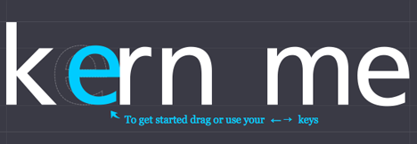
The term kerning refers to adjusting the space between two letters. If letters in a typeface are spaced too uniformly, they make a pattern that doesn’t look uniform enough. Gaps occur, for example, around letters whose forms angle outward or frame an open space (W, Y, V, T, L). In metal type, a kerned letter extends past the lead slug that supports it, allowing two letters to sit more closely together. In the digital typefaces used today, the space between letters is controlled by a table of kerning pairs, which specify spaces between different letter combinations. Because the space between characters expands as the type size increases, designers often fine-tune letterspacing when working with large letters. As the word “rub†gets bigger, the gap between u and b grows more obvious.
When I make an alphabet font I spend a lot of time kerning the font. It is tedious but necessary work.
Go to http://type.method.ac/ and try your hand at kerning.
(Thanks Paul!)


