new ornamental type by steven heller & gail anderson
/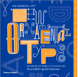 New Ornamental Type presents a dazzling kaleidoscope of highly decorated or fancy fonts across a wide spectrum of styles and effects. Psychedelia, Hip-Hop, Gothic, flowers, smoke, hair and electricity are just a few of the styles for the hundreds of examples inspired by nature, history, and just about anything that is visually expressive.
Beginning with a historical overview of ornament and how it has evolved since the beginning of the twentieth century, the book also includes essays introducing the background, influences, and outstanding aspects of typographical design.
Steven Heller is co-chair of the MFA Designer As Author Department, School of Visual Arts, New York. Among his recent publications are Handwritten and New Vintage Type, both published by Thames & Hudson. Gail Anderson is creative director of design at SpotCo, New York, a former senior art director of Rolling Stone magazine, and an American Institute of Graphic Arts medalist.
I recently ordered a bunch of new graphic arts books. Time for something current. My home library space is so much smaller than my last studio library space that I gave my old design library to my young MATC graphic artist friend Amber. It all went to a good home and she is starting out her career and I am at a point where I can be more specific in my book choices.
I ordered this book and like it even more than I thought. I have been giving serious thought to a series of Drop Cap fonts. An alphabet would look somewhat like this cover but with letters I would design. The idea behind this font would be to use this as a drop cap on a web page. Now when you use the drop caps you can find online like those of the fabulous Jessica Hische they are objects not fonts. If you use one and then re-post your page to Facebook that letter will not show up. So it could create searching issues.
The downside is that the objects as letters are in color and a piece of art. A font is in black only, I cannot add color. Although you could work around that by coloring the letter. If you would be using it for desktop design you could make it a vector and add color. Or put a colored box behind it.
Any thoughts from anyone on the need for a Drop Cap font?
(If anyone would like this book there is a link to the right.)

