penmanship, calligraphy & lettering
/
This weekend I had serious fun attending Crystal Kluge's modern penmanship class in St. Paul. You can see her fonts here. I also enjoyed the rare chance to talk shop with another type designer!

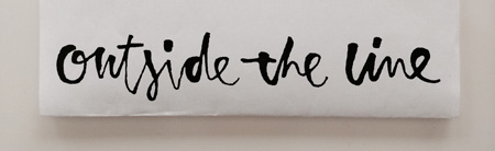
This is Crystal's lettering. Oh how I love those flourishes.
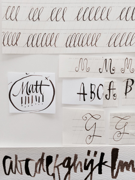
And here are my hen scratchings. But in my defense I didn't take the class to be a bad version of Crystal but a better version of myself.
I learned a lot. Very beginning things like how to hold the pen and not to go so fast. I was easily the worst in class. Everyone else put their nib in their holder and started doing beautiful calligraphy. But then it was a talented bunch.
I got to do a lot of thinking in class and ponder a possible 4 new alphabet fonts. I would really like to make a font that looks like my new logo. I used a folded nib to get the above lettering.
A really great class for both beginners and professionals alike. And as you can see from the first photo she has another class coming up in March. If you are in the area I think you would enjoy it.
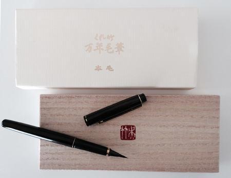
 Since this was a lettering kind of weekend my friend Laurie, who I look the class with, gave me this oh-so beautiful real sable brush pen for my birthday. So now I have another tool that I don't know how to use. But it makes me happy just to hold it. This is a Kuretake Japanese pen.
(Thanks again Laurie! For the fun, drinks and the PEN!)